Syndigo · Commerce
Syndigo: 400+ Clashing Components Consolidated Into 200 for a Platform With 18,000+ Customers
Rebuilt a fragmented enterprise design system as one governed component library connected to production code.
- Role
- Senior Manager, UX Design
- Scope
- Design system, syndication, and nutrition tools
- Focus
- Commerce
- Designer
 Gideon Awolesi
My contribution · Syndigo
Design system, syndication, and nutrition tools
The work focused on component governance, shared review between design and engineering, and a prototyping workflow built on the real product components instead of generic placeholders.
- 200
- components consolidated
- 1
- governed component library
- UI Relay
- Figma plugin
What I owned
- 01Audited duplicate components across products and consolidated them into approved patterns.
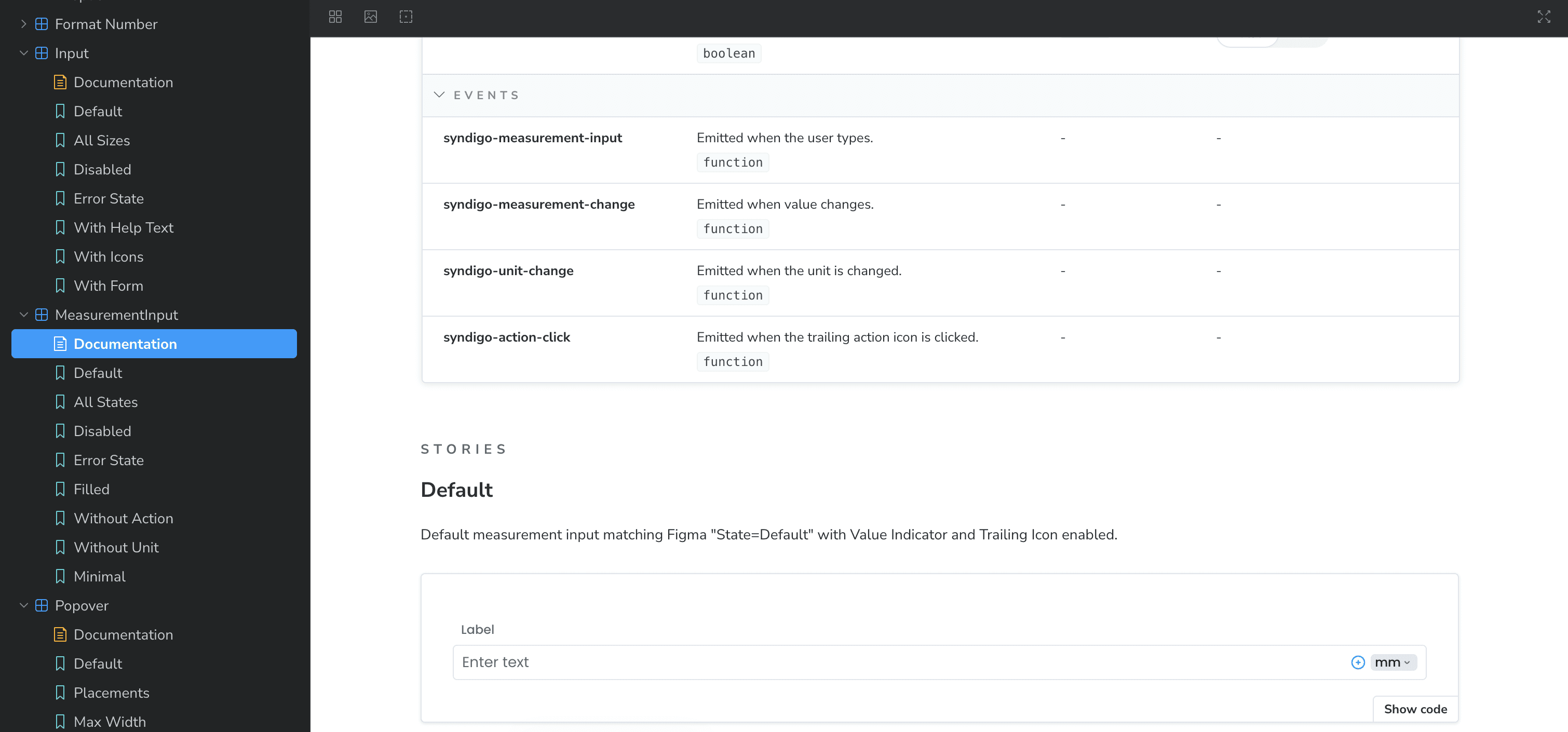
- 02Connected Figma components to Storybook so design and implementation could be reviewed together.
- 03Managed designers and configured AI prototyping to use the real product components.
Clickable prototypes
Open the Syndigo prototypes
Each project has its own clickable prototype. Fix a product in the publication tracker, map attributes to what your recipients ask for, configure the Nutrition Panel in an import job, or apply a recipe yield.
Overview
About the project
Project overview
- Role: Former Senior Manager, UX Design at Syndigo, from June 2025 to April 2026.
- What Syndigo does: Brands and manufacturers use Syndigo to manage their product content and send it to the retailers, distributors, and data pools that sell their products. The platform serves more than 18,000 customers in 60 countries.
- What I worked on: I rebuilt the design system and managed two product designers. On the product side, I designed the publication tracker and the container mappings for import jobs. I also led the UX on attribute mapping and directed the design of Nutrition Analysis. In 2026, I also redesigned the error popup and the GDSN bulk publish results, and I built a Figma plugin that connects designs to the component code.
- Solution: A single code-connected design system across Syndigo’s product suite. It replaced the duplicated component libraries and linked the approved components to Storybook, GitHub, and the company’s AI prototyping tools.
- Objective: Give designers, frontend engineers, and product managers the same components to work from, so there was less drift between Figma and production and the accessibility requirements stayed visible.
I partnered with the VP of Design, the Director of Design, and frontend engineering on design-system governance and delivery. In 2026, I rebuilt four of the product tools as clickable coded prototypes, one for each project.
Prototypes
These were separate projects at Syndigo, so each one has its own tab below, and each product tab has its own interactive prototype.
Each prototype follows what the team designed or reviewed at Syndigo, from the meeting notes and the design files. The attribute mapping screen follows the version the team groomed in August 2025, and a contract designer drew that screen. The prototypes run on sample products, recipients, and recipes, and they aren't Syndigo's production software.
Design system: process
The audit told me what needed to change and in what order.
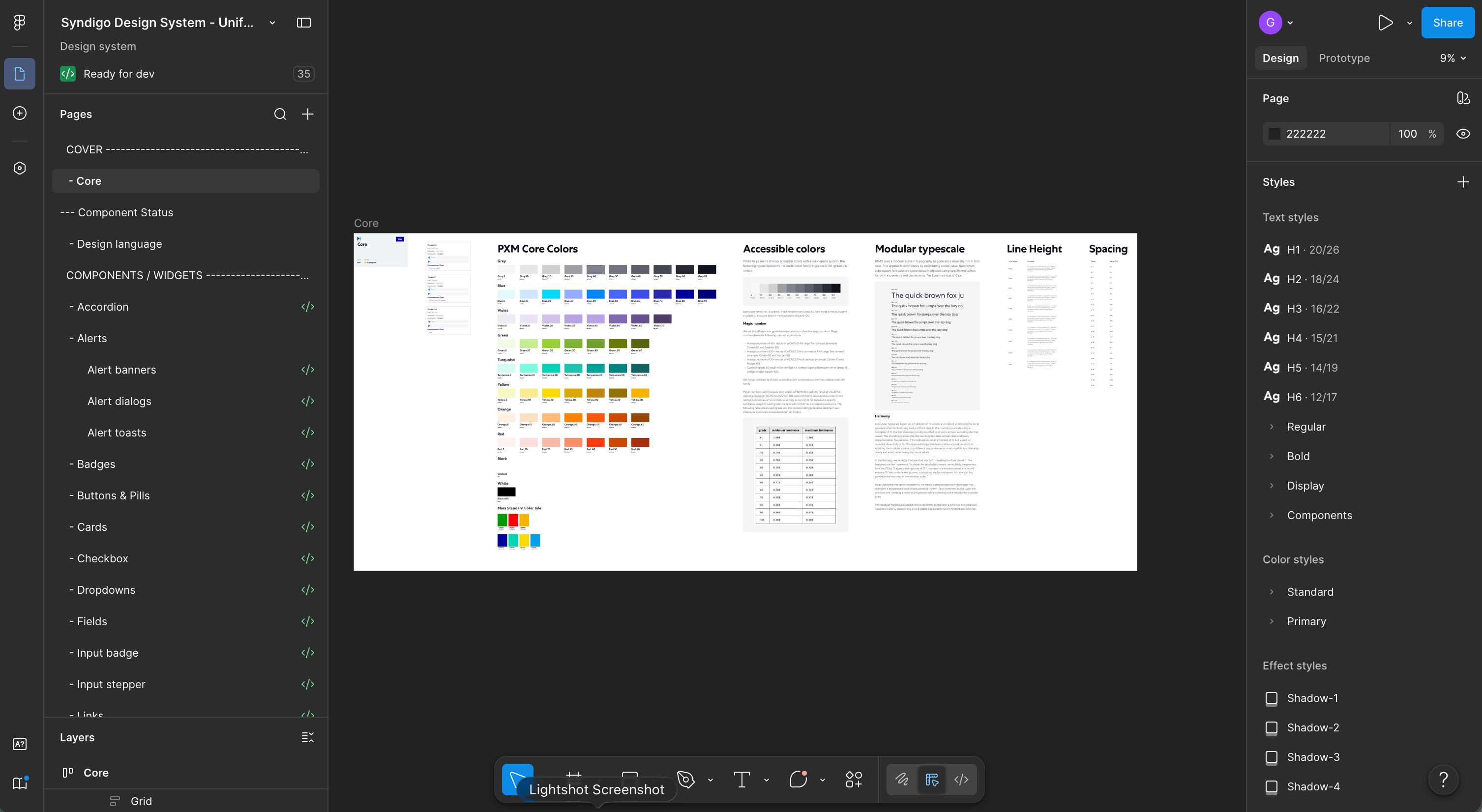
- Audit: I inventoried every component across the products, mapped Figma against production, and flagged every duplicate and inconsistency.
- Consolidation: I reduced each set of duplicates to one canonical component and documented its anatomy, variants, and version history. Each design frame also showed if the work was in ideation, in progress, or complete, and had the relevant ticket attached.
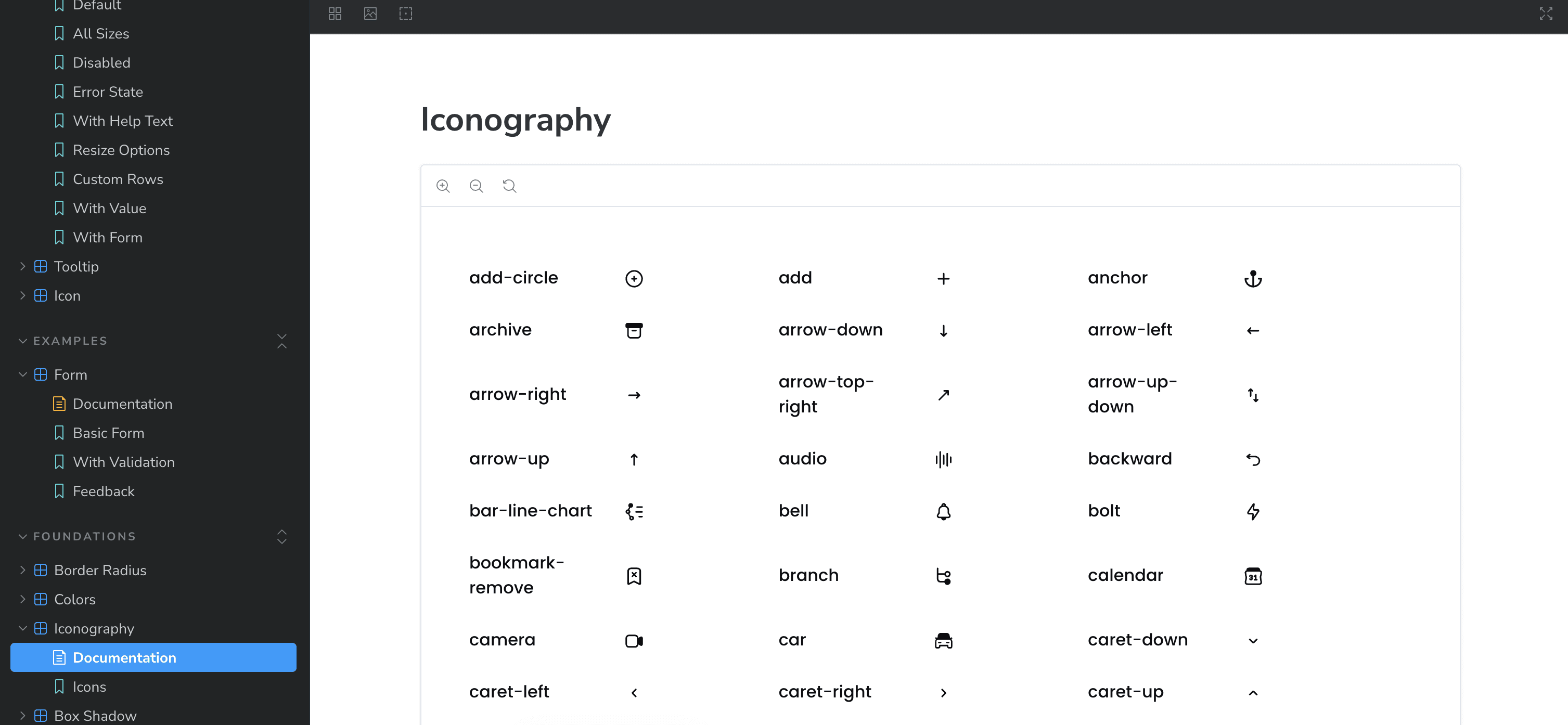
- Code Connect and Storybook: I wrote the Code Connect and component files for all 200 components. In Storybook, you could see the design and the coded component side by side.
- Repository work: Engineering gave me access to the codebase, where I maintained the component and Code Connect files directly.
- Coded prototypes: I introduced Figma MCP to turn designs into clickable prototypes before development. I also configured Lovable and Claude Design to use the approved components, so anything they generated stayed within the system.
- Accessibility: I built semantic structure, labels, and implementation guidance into the components, so the accessibility requirements could still be reviewed during design and delivery.
Context and problem statement
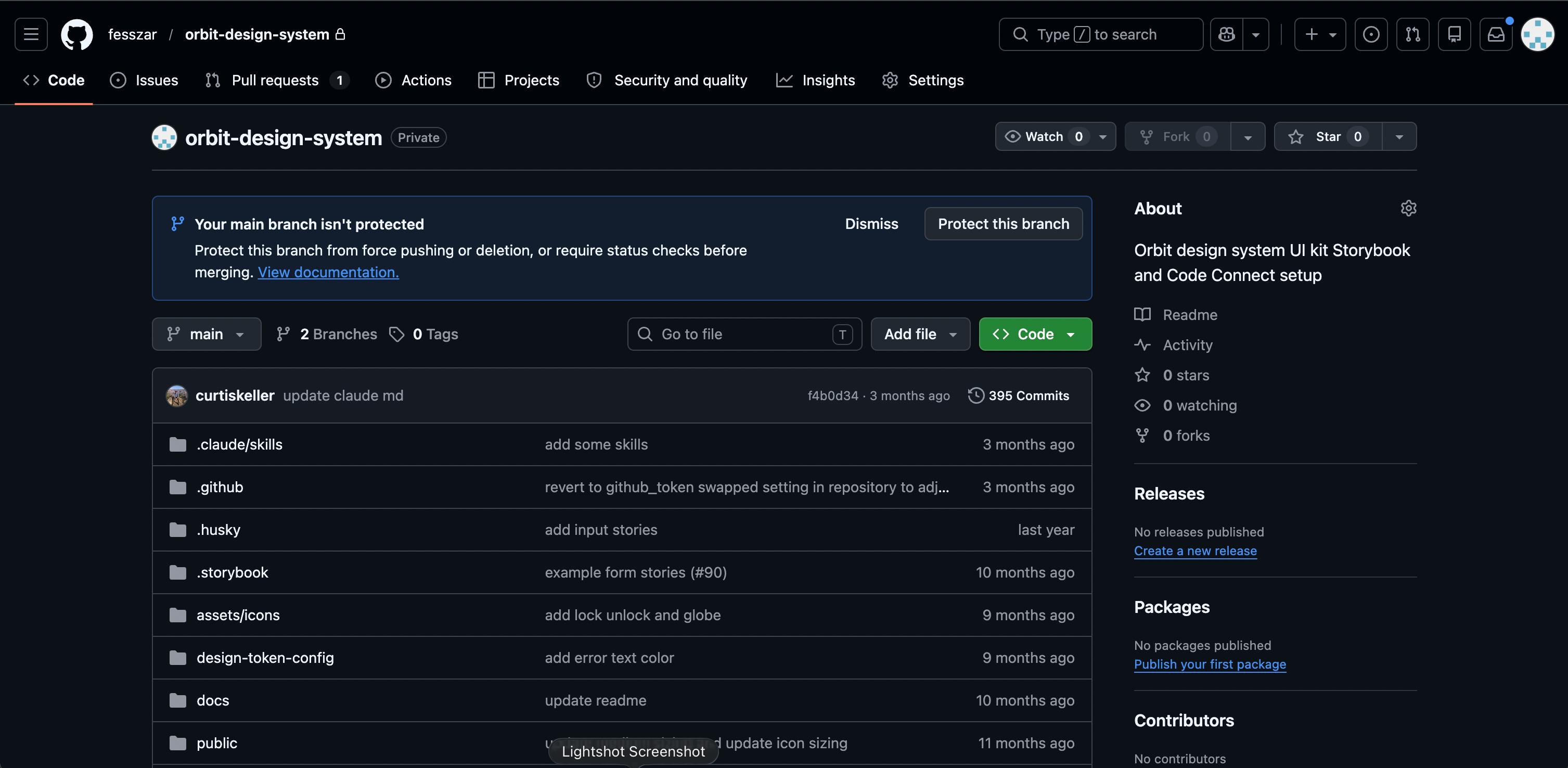
The design system didn’t have a clear structure, and there was very little governance. The same component often existed in several inconsistent versions across products, and nothing connected design to shipped code. There wasn’t a Storybook, the components weren’t connected to code, and UX had no presence in GitHub.
Designers, engineers, and product managers each read the system differently. Delivery slowed down because engineers kept rebuilding interface patterns from inconsistent specifications.
Stakeholder analysis
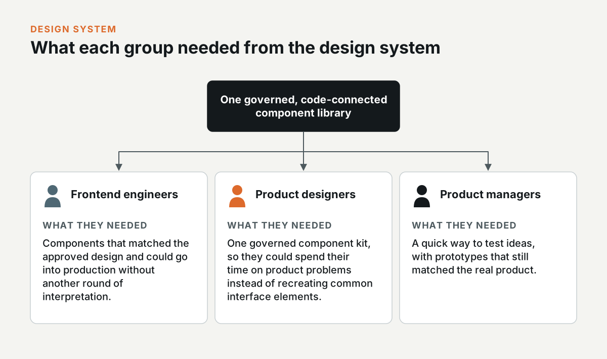
- Frontend engineers: They needed components that matched the approved design and could go into production without another round of interpretation.
- Product designers: They needed one governed component kit, so they could spend their time on product problems instead of recreating common interface elements.
- Product managers: They needed to test ideas quickly with prototypes that still matched the real product.
System audit
I started by looking at how teams were actually using the existing system, in Figma and in production.
- Component inventory: I catalogued the components in use and identified duplicates.
- Figma-to-production mapping: I compared the design libraries with the shipped interfaces to find where the two had drifted apart.
- Team interviews: I spoke with designers and engineers about where the system helped and where they had to work around it.
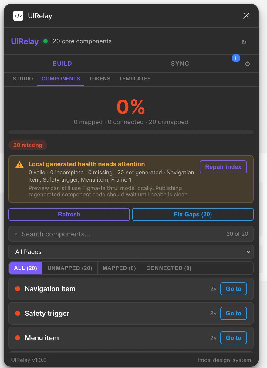
- UI Relay Figma plugin: I built a Figma plugin that maps components to code, tracks coverage and code health, generates and syncs component code, manages tokens and templates, and flags gaps. With it, keeping the system maintained became part of the team’s normal workflow.
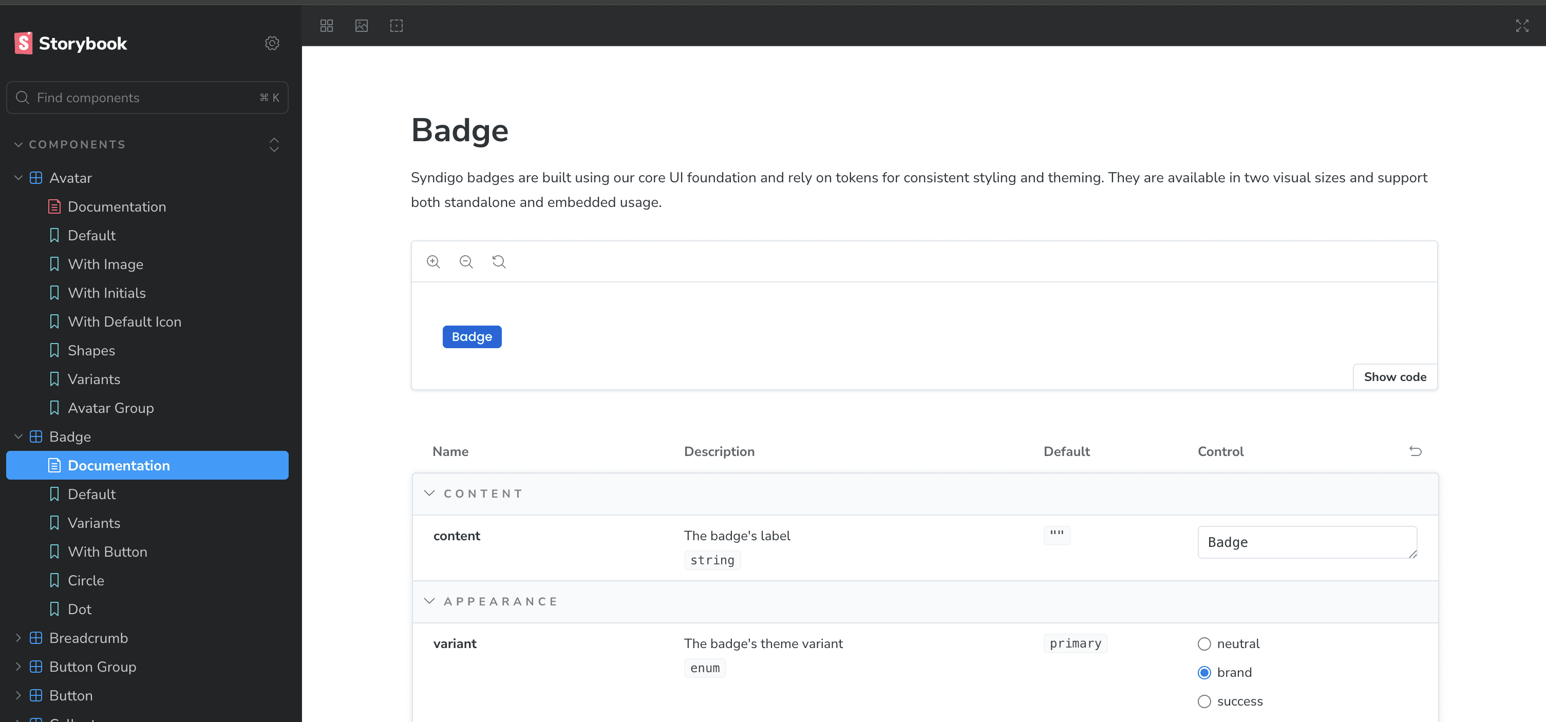
Challenges and solutions
Design and code weren’t connected. I got access to the repository and maintained the Code Connect and component files myself, so approved design decisions could reach production without anyone having to interpret them again.
The library was also fragmented. I consolidated the duplicate patterns and built the UI Relay plugin to catch drift whenever new work came into the system.
To get teams to adopt it, I connected the system to coded prototypes, Lovable, and Claude Design. That way, teams could keep using the tools they preferred and still work with the approved components.
Accessibility
The components used semantic structure, ARIA roles, and clear labels. They came with representative screen-reader checks and written guidance for teams extending the system, and information didn’t rely on colour alone. This case study does not claim a universal conformance level.
Impact metrics
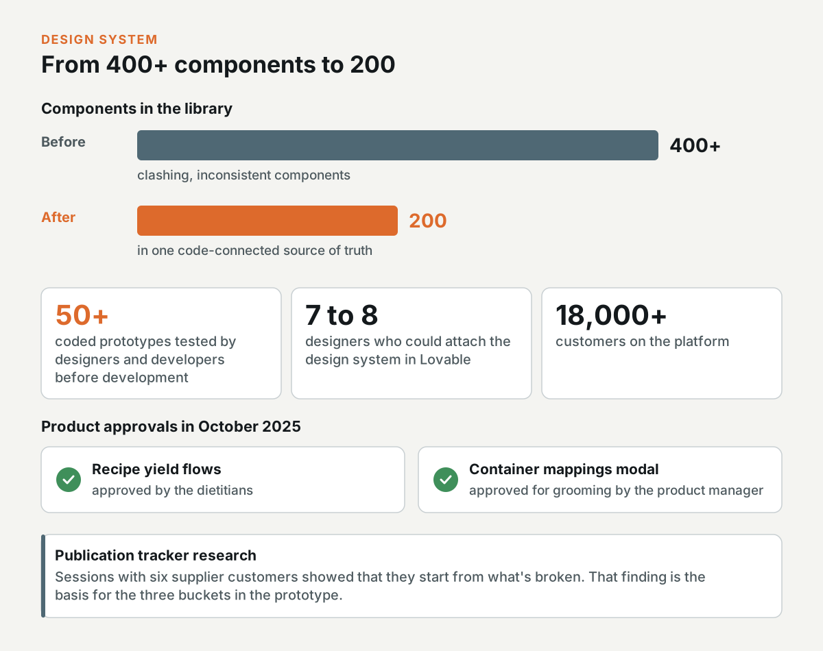
I consolidated more than 400 clashing, inconsistent components into 200, in a single code-connected source of truth.
Syndigo got its first design-to-engineering pipeline, and designers and developers tested more than 50 coded prototypes before development.
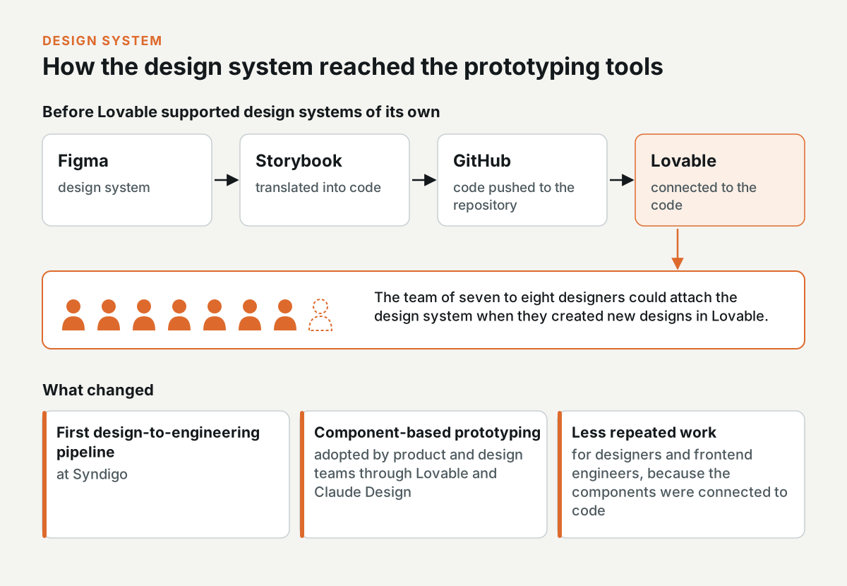
Product and design teams adopted component-based prototyping through Lovable and Claude Design.
Before Lovable supported design systems of its own, I translated the Figma design system into Storybook code, pushed it to GitHub, and connected it to Lovable, so the team of seven to eight designers could attach the design system when they created new designs there.
Because the components were connected to code, designers and frontend engineers repeated less work.
On the product side, the dietitians approved the recipe yield flows in October 2025, and the product manager approved the container mappings modal for grooming the same month.
The publication tracker research with six supplier customers showed that they start from what's broken, and it's the basis for the three buckets in the prototype.
The publication tracker
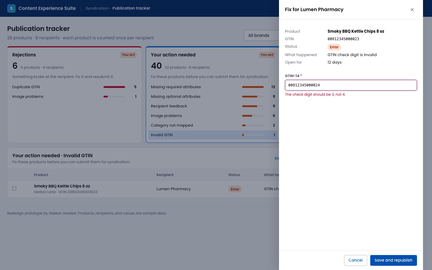
Interactive prototype: Open the prototype. Try this: Select Invalid GTIN under Your action needed and press Fix. The drawer tells you what the check digit should be.
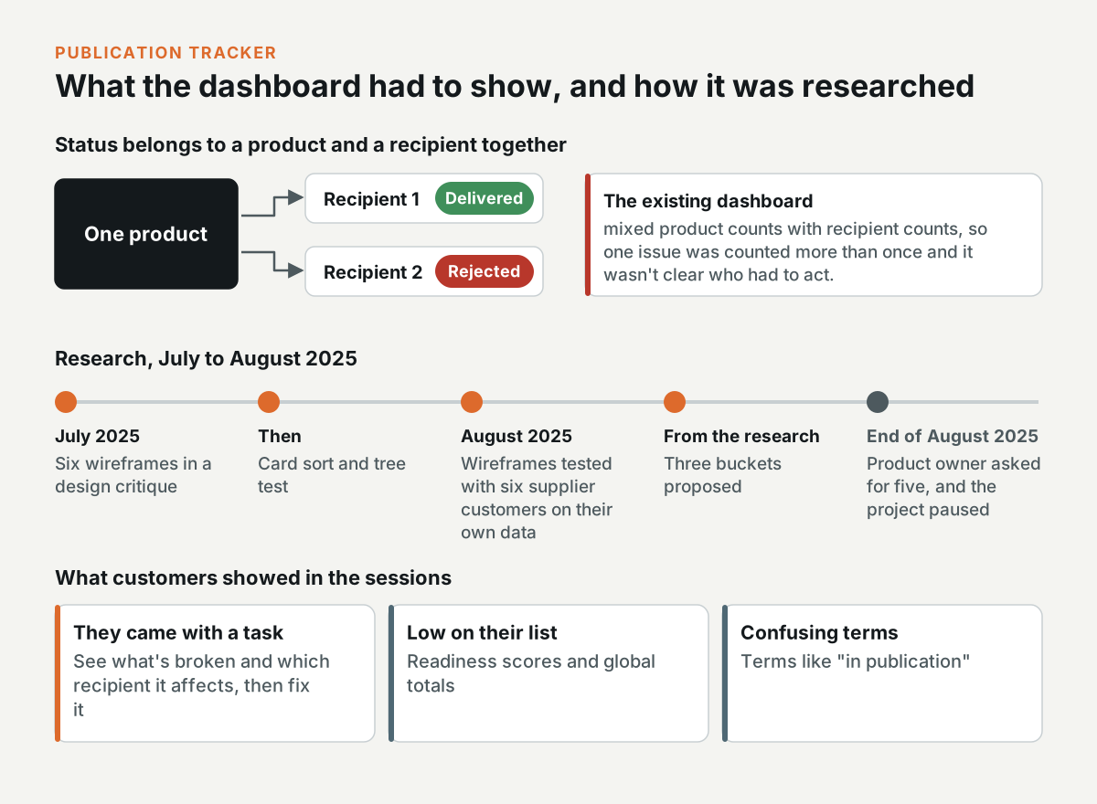
Suppliers publish each product to many recipients, and the same product can be delivered to one retailer and rejected by another, so the status belongs to the product and the recipient together. Some accounts have more than 50 recipients and thousands of products. In my review, the existing dashboard mixed product counts with recipient counts, so the same issue was counted more than once and it wasn't clear who had to act. Customers mostly skipped it and went straight to the product list.
In July 2025, I presented six wireframes in a design critique. They went from an overview of the publication buckets to a card for each recipient, and the last one covered every requirement in the product spec. I planned the research with Syndigo's UX researcher. We started with a card sort and a tree test, and in August 2025 we tested the wireframes with six supplier customers, using each customer's own dashboard data.
Customers came to the dashboard with a task in mind. They wanted to see what was broken and which recipient it affected, so they could fix it. Readiness scores and global totals were low on their list, and terms like "in publication" confused them.
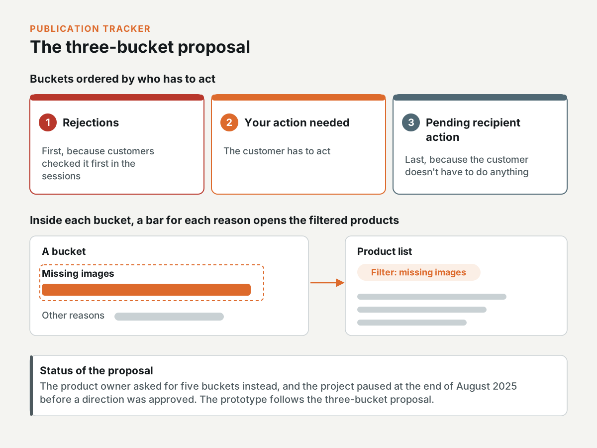
From the research, I proposed three buckets, ordered by who has to act: Rejections, Your action needed, and Pending recipient action. Rejections come first, because that's what customers checked first in the sessions. Pending recipient action comes last, because the customer doesn't have to do anything about it. Inside each bucket, a bar for each reason, such as missing images, opens the products with that filter applied.
The product owner asked for five buckets instead, and the project was paused at the end of August 2025, before a direction was approved. The prototype follows my three-bucket proposal.
How the tracker prototype works
- Publication tracker: The buckets count product and recipient pairs, because the status belongs to the pair. Each reason bar opens the products with that reason, and Fix opens a drawer with the field to change. The drawer checks the value before you republish, and for a GTIN, it tells you what the check digit should be.
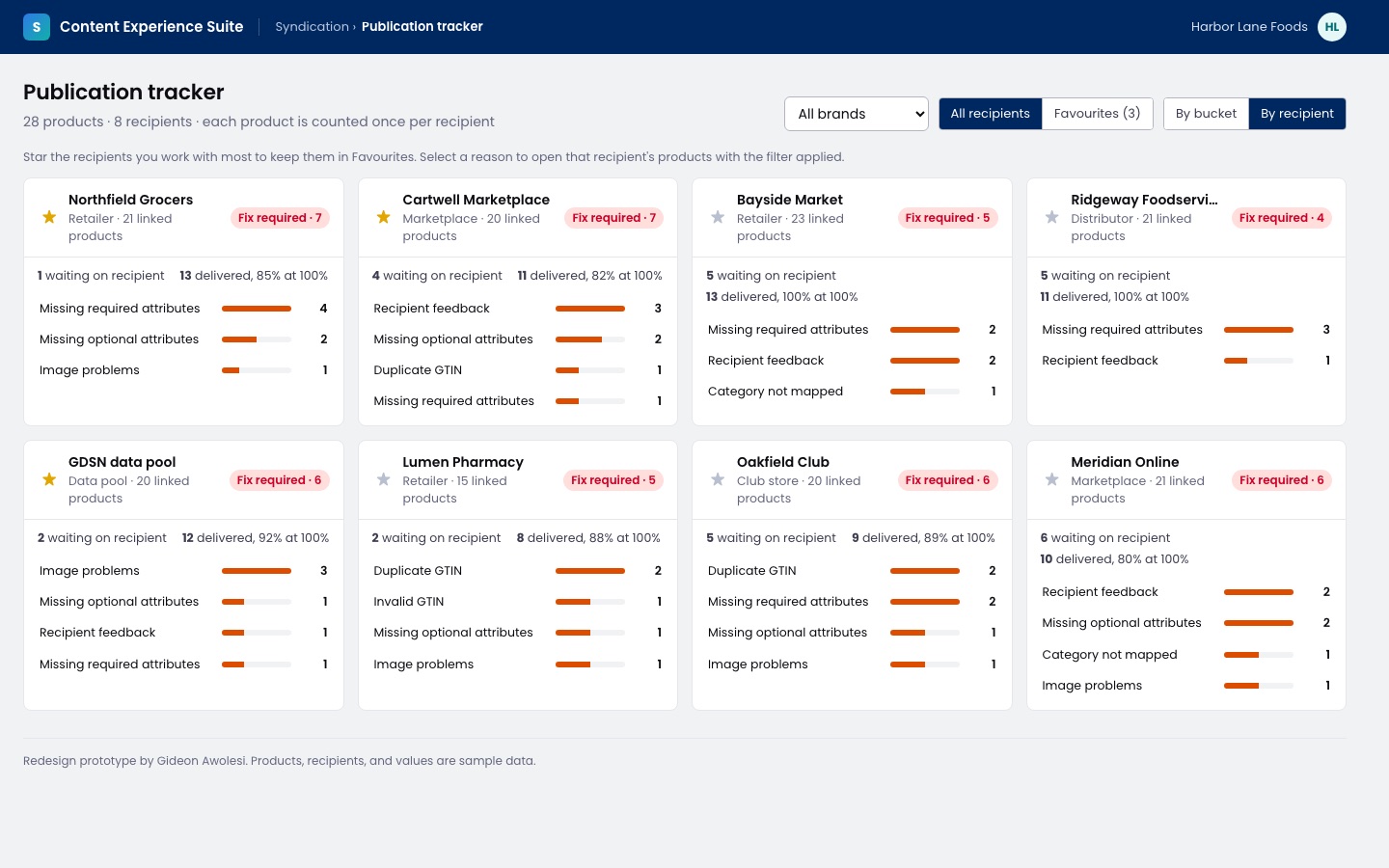
- By recipient: Each recipient card shows how many products need a fix, and its reason bars open that recipient's page with the filter applied. Favourites limit the view to the recipients you work with most.
Attribute mapping
Interactive prototype: Open the prototype. Try this: Press Open attribute mapping, then drag the node on Short Name to Short Description.
Attribute mapping matches a supplier's own attributes to what each recipient asks for, with transformations where the values need to change. At the time, Syndigo's internal teams prepared a lot of this in spreadsheets for suppliers, and some accounts have thousands of attributes.
I was the UX lead on the project in July and August 2025. I wrote the design brief and kept it up to date as the requirements changed, planned the research with the internal users who map attributes for clients, and gave design direction and critique. My first wireframes put the recipients in columns next to Syndigo's global attributes, and I sketched a node on every attribute for the mapping lines to connect to. A contract designer took over the screen designs in September 2025, and I reviewed them.
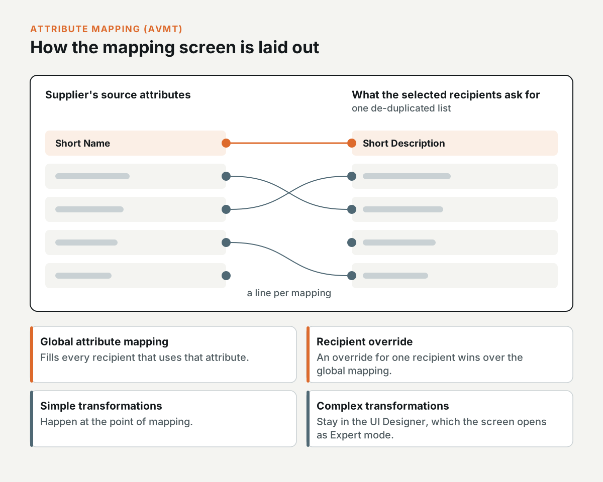
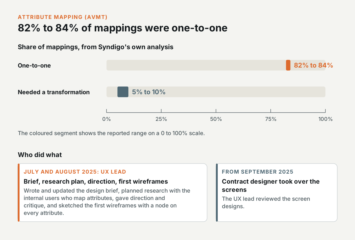
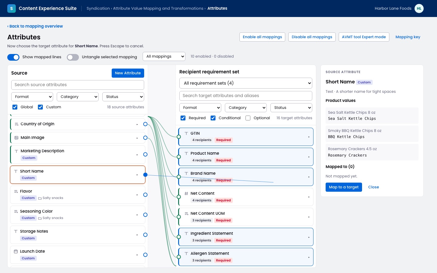
The screen in the prototype follows the version the team groomed in August 2025. Your source attributes are on the left, and the right side has one de-duplicated list of what the selected recipients ask for. A line connects each mapping. A mapping to a global attribute fills every recipient that uses it, and an override for one recipient wins over it. Simple transformations happen at the point of mapping, and complex ones stay in the UI Designer, which the screen opens as Expert mode. In Syndigo's own analysis, 82% to 84% of mappings were one-to-one, and 5% to 10% needed a transformation.
How the AVMT prototype works
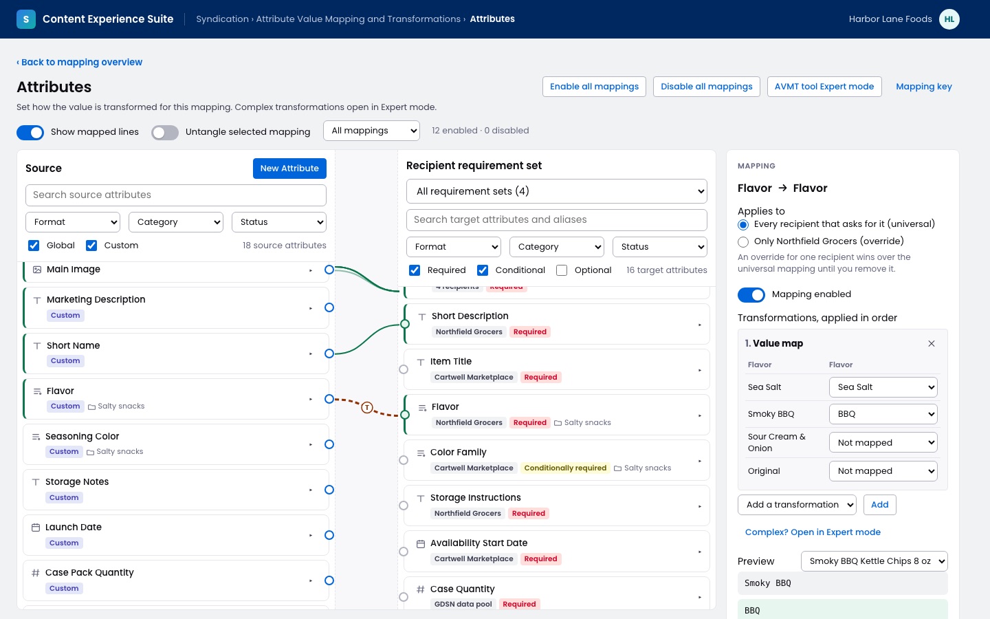
Attribute mapping: Drag the node on a source attribute to a target, or click the node and then the target, and the valid targets turn blue while you map. A green line fills every recipient that asks for the attribute, and a blue line is an override for one recipient. A dashed line means the mapping has a transformation.
Select a line to open the mapping in the right panel, with the transformations in order and a preview for a sample product. Here, a value map turns Smoky BBQ into BBQ for a recipient that has its own list of flavors.
Container mappings for import jobs
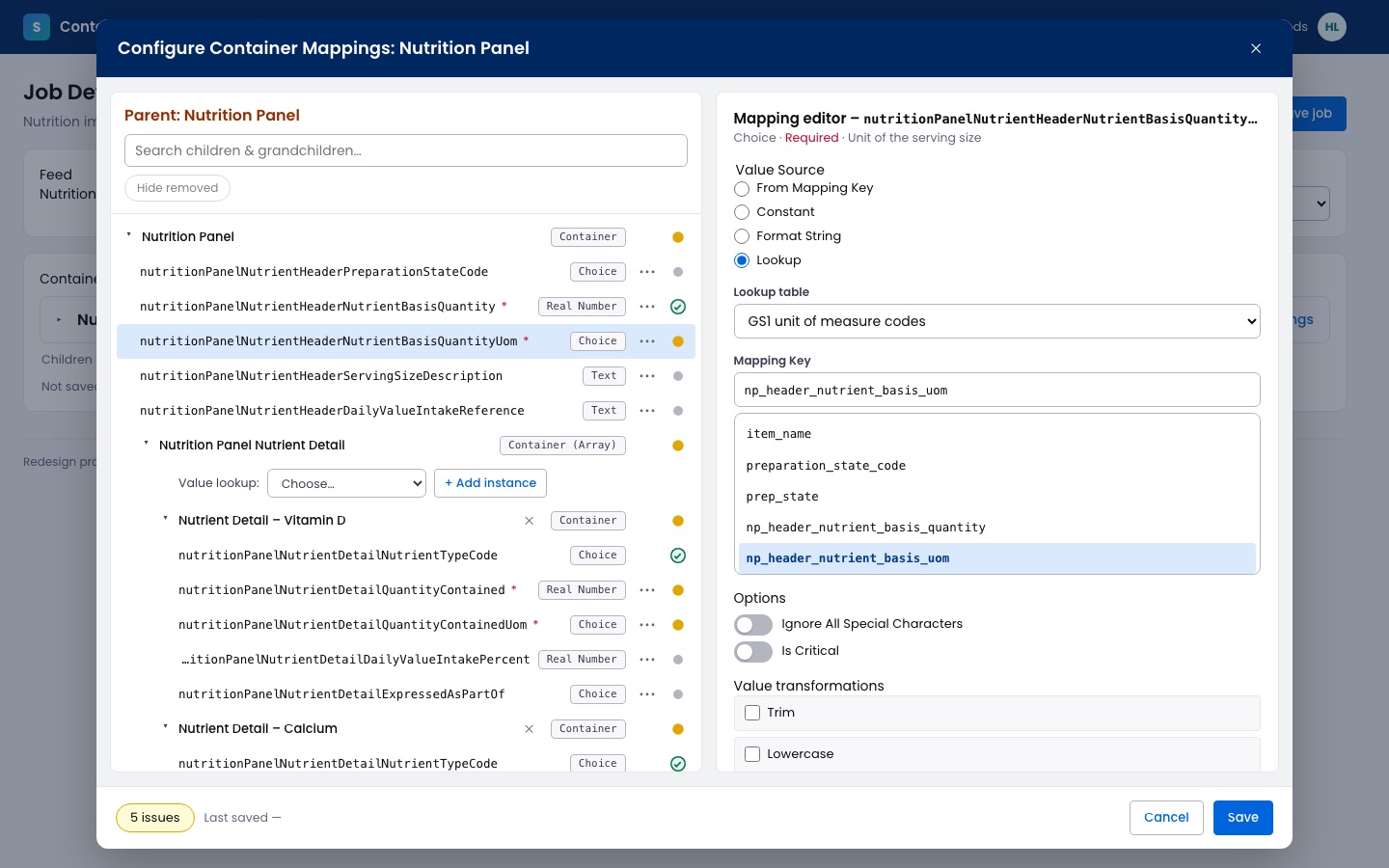
Interactive prototype: Open the prototype. Try this: Press Configure container mappings, map the serving size, and press Save to see which required attributes are left.
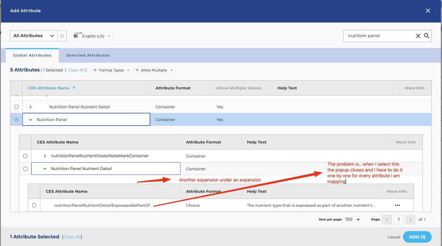
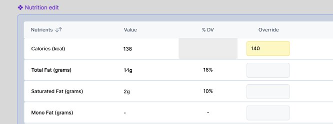
Import jobs bring a customer's Excel file into CES, and in the UI Designer, each column in the file is mapped to a CES attribute. Some attributes are containers. The Nutrition Panel, for instance, holds the serving size, a nutrient detail for every nutrient, and a footer note. In the old UI Designer, you added the children of a container one at a time from a picker that closed after each choice, inside nested forms that got narrower at every level. A stakeholder marked the problem on the screenshot above.
A stakeholder estimated that loading several containers took about 10 minutes, and that 40 job configurations would take about 80 weeks in the current process.
I took over the ticket in September 2025. In my first version, a Configure container mappings button opens the modal once the parent attribute is chosen. The left side lists the children and grandchildren of the container, with search. The right side has the mapping settings that the UI Designer already uses: a mapping key, a constant, a format string, or a lookup, with the options and the value transformations. A yellow dot marks an attribute that still needs work, and a green check marks a mapped one.
Internal users who set up these jobs reviewed it at the end of September 2025. They add 10 to 20 nutrients out of hundreds, so each nutrient became an instance that you add from a value lookup. They also asked for the colours to stay as an indicator that doesn't block saving. I then rebuilt the design in the CES design system, the product manager approved it in October 2025, and it went to grooming the same month.
How the container mappings prototype works
Container mappings: The tree shows the children and grandchildren of the Nutrition Panel, with a type and a status for each one. The mapping editor keeps the existing options, and a change only counts once you apply it.
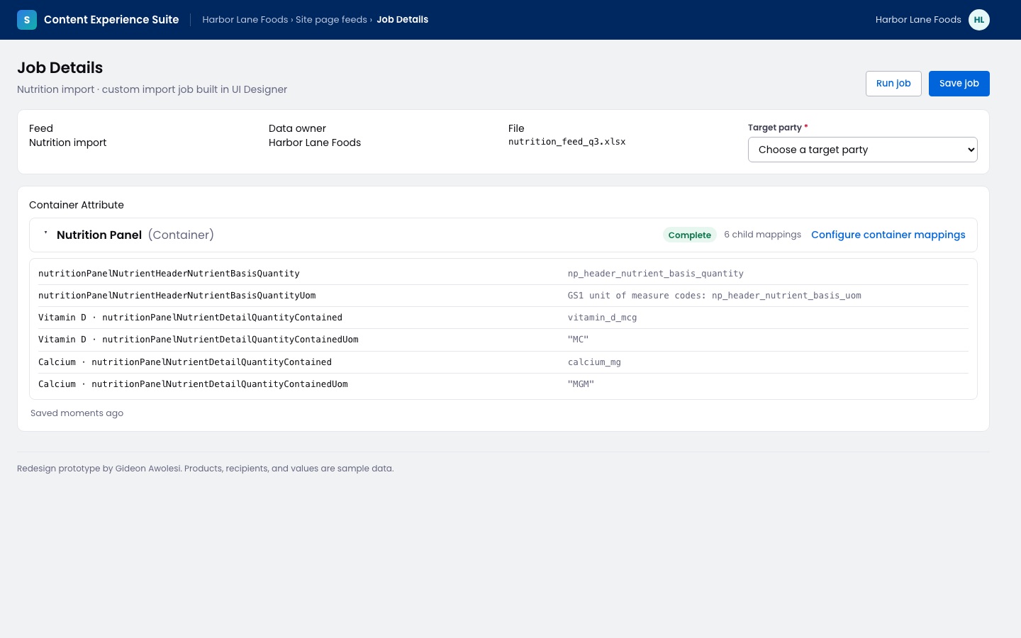
Save lists the required attributes that aren't mapped yet. After saving, the job shows the container as complete, with its child mappings.
Nutrition Analysis
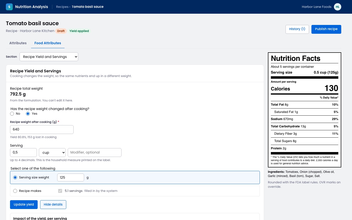
Interactive prototype: Open the prototype. Try this: Choose Recipe makes under Select one of the following, enter 6 servings, and press Apply yield.
Food brands use Nutrition Analysis to build recipes and calculate the nutrition facts. A designer on my team led the product design, and I directed the work. I set up the ticket process at the start, ran ideation with the designer, sat in on two test sessions with dietitians in July 2025, and reviewed the designs against a UX checklist I wrote for the team.
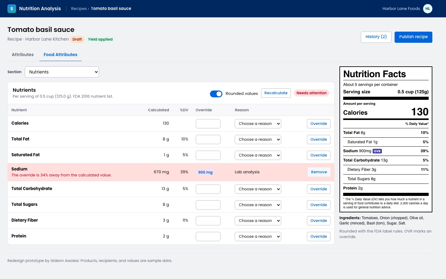
In October 2025, the recipe screens moved into a Food Attributes tab, with a section for the formulation, the recipe yield and servings, the nutrients, the ingredient statement, and the allergens. The yield flow asks if the recipe weight changed after cooking. You then enter the serving in a household measure, and you give either the serving size weight or the number of servings the recipe makes, and the system fills in the other one. I built a coded interactive prototype of the tab from the Figma file, and the dietitians approved the yield flows.
Later that year, I rebuilt the live production screens in Figma so the team had a current reference, and in December 2025 I designed four more recipe yield flows. The product manager adopted my coded prototype as the reference for the next round of work.
How the Nutrition Analysis prototype works
- Yield: You say if the weight changed after cooking and enter the serving. Then you choose the serving size weight or the number of servings. Apply yield updates the label, and View details compares the values before and after.
- Nutrients: An override needs a reason, and an override that's more than 20% away from the calculated value is flagged for review before you publish.
The error popup and the GDSN publish results
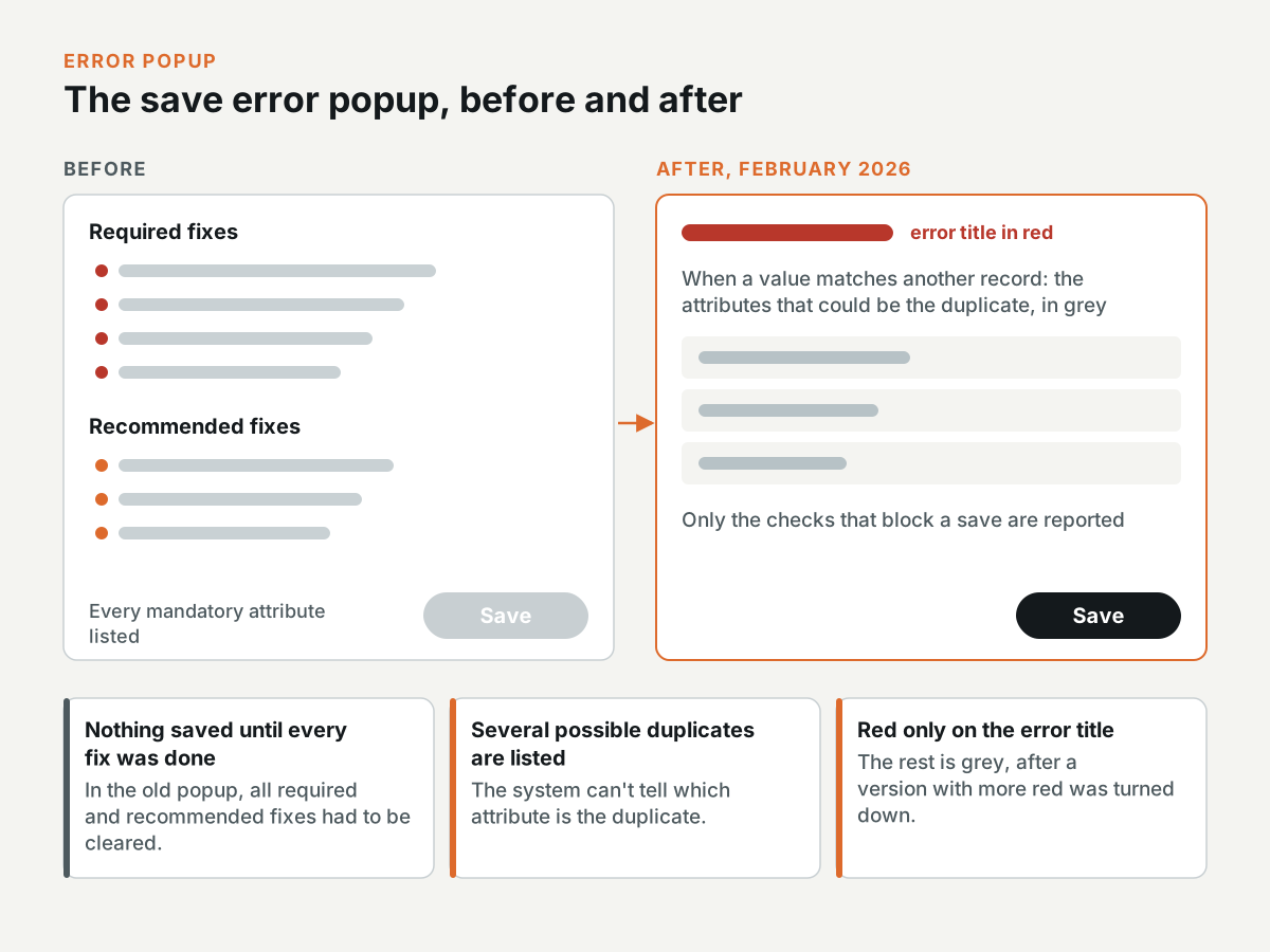
In February 2026, I redesigned two smaller parts of the platform. The old error popup listed every mandatory attribute under required fixes and recommended fixes, and nothing saved until all of them were done. The new popup only reports the uniqueness checks that block a save. When a value matches another record, it lists the attributes that could be the duplicate, because the system can't tell which one it is. The error title is in red and the rest is in grey, after a version with more red was turned down.
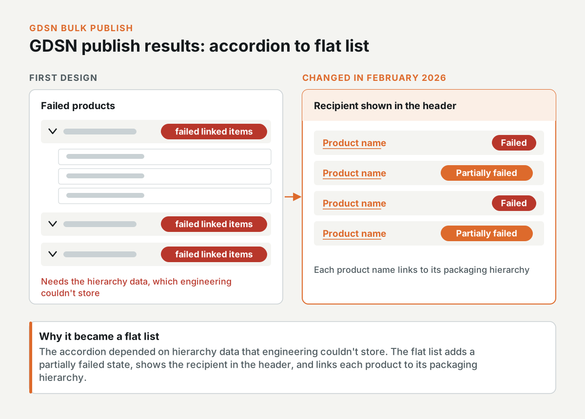
The GDSN bulk publish results started as an accordion of failed products, each with a count of its failed linked items. Engineering couldn't store the hierarchy data, so in February 2026 I changed the design to a flat list. The new list has a partially failed state and shows the recipient in the header. Each product name links to its packaging hierarchy.
Design-to-code tooling
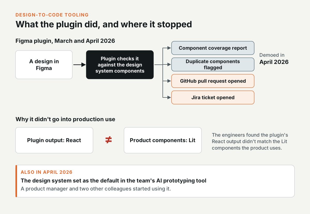
In March and April 2026, I built a Figma plugin that checks a design against the design system's components. It reports the component coverage and flags duplicate components, and it can open a GitHub pull request and a Jira ticket from a design. I demoed it in April 2026. It didn't go into production use, because the engineers found that its React output didn't match the Lit components the product uses.
I also set the design system as the default in the team's AI prototyping tool, and a product manager and two other colleagues started using it in April 2026.
Leading the design team
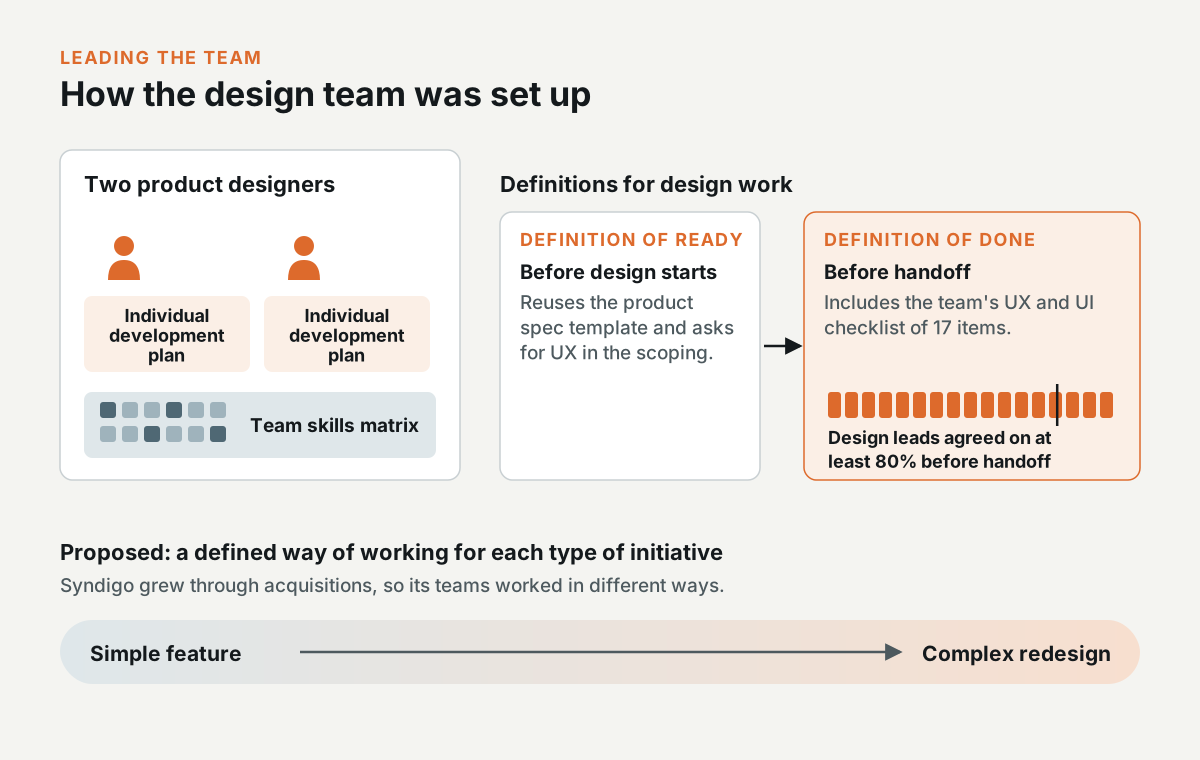
I managed two product designers. I wrote an individual development plan for each of them, and I built a skills matrix for the team.
I also wrote a Definition of Ready and a Definition of Done for design work. The Definition of Ready reuses the product spec template and asks for UX in the scoping. The Definition of Done includes the team's UX and UI checklist of 17 items, and the design leads agreed that designs would meet at least 80% of it before handoff.
Syndigo grew through acquisitions, so its teams worked in different ways. I proposed defining the way of working for each type of initiative, from a simple feature to a complex redesign.
Need this level of detail in your product?
Work through the hard product decisions early.
If you’re a product team, that can mean a focused design, system, or prototype project. If you’re hiring, it’s a chance to look closer at how I work across research, interfaces, and code.